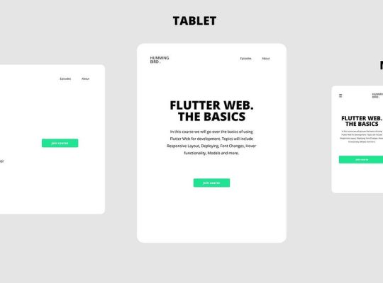

When building Flutter apps, one of the first things you’ll need to master is layout. Flutter’s flexible widget-based system makes arranging UI elements straightforward, but at first glance, widgets like Row, Column, and Flex can feel confusing. This guide breaks them down so you can design responsive and beautiful interfaces with confidence.
1. Understanding the Layout System in Flutter
In Flutter, everything is a widget—from a simple button to complex layouts. To organize how widgets appear on screen, Flutter provides layout widgets that control alignment, spacing, and distribution. Among the most essential are:
- Row → Arranges children horizontally.
- Column → Arranges children vertically.
- Flex → A more customizable parent widget that Row and Column are built on.
2. The Row Widget
The Row widget places its children side by side, in a horizontal line.
Example:
Row(
  mainAxisAlignment: MainAxisAlignment.spaceAround,
  crossAxisAlignment: CrossAxisAlignment.center,
  children: [
    Icon(Icons.home, size: 40, color: Colors.blue),
    Icon(Icons.star, size: 40, color: Colors.orange),
    Icon(Icons.person, size: 40, color: Colors.green),
  ],
)
✔ Use Row when: You want items aligned horizontally, such as navigation bars, toolbars, or icon lists.
3. The Column Widget
The Column widget works just like Row—but stacks its children vertically.
Example:
Column(
  mainAxisAlignment: MainAxisAlignment.center,
  crossAxisAlignment: CrossAxisAlignment.start,
  children: [
    Text("Welcome", style: TextStyle(fontSize: 24, fontWeight: FontWeight.bold)),
    Text("Flutter makes layouts easy."),
    ElevatedButton(onPressed: () {}, child: Text("Get Started")),
  ],
)
✔ Use Column when: You want vertical alignment, such as forms, settings pages, or stacked text elements.
4. The Flex Widget
The Flex widget is the parent class for Row and Column. It allows you to specify the direction of layout explicitly:
Axis.horizontal(like Row)Axis.vertical(like Column)
This gives you more control when switching between layouts dynamically.
Example:
Flex(
  direction: Axis.horizontal,
  mainAxisAlignment: MainAxisAlignment.spaceEvenly,
  children: [
    Icon(Icons.cake, size: 50, color: Colors.pink),
    Icon(Icons.local_pizza, size: 50, color: Colors.brown),
    Icon(Icons.local_cafe, size: 50, color: Colors.teal),
  ],
)
5. Adding Flexibility with Expanded & Flexible
Sometimes, you’ll want children in a Row/Column to take up available space proportionally. That’s where Expanded and Flexible come in.
Example with Expanded:
Row(
  children: [
    Expanded(flex: 2, child: Container(color: Colors.red, height: 50)),
    Expanded(flex: 1, child: Container(color: Colors.blue, height: 50)),
  ],
)
Here, the red container takes 2x the space of the blue one.
6. Alignment and Spacing Options
Flutter gives you fine control over positioning:
mainAxisAlignment→ controls spacing along the Row/Column’s main axis.- Options:
start,center,end,spaceAround,spaceBetween,spaceEvenly.
- Options:
crossAxisAlignment→ controls alignment on the perpendicular axis.- Options:
start,center,end,stretch,baseline.
- Options:
7. When to Use Row, Column, or Flex?
| Widget | Use Case |
|---|---|
| Row | Align elements horizontally (menu bar, icons row). |
| Column | Align elements vertically (login form, profile info). |
| Flex | Use when you need dynamic layout direction or more fine-grained control. |
8. Pro Tips for Beginners
- Wrap text or buttons in Expanded for adaptive layouts.
- Combine Row inside Column (and vice versa) for complex UIs.
- Use Padding and SizedBox for spacing instead of empty Containers.
- Test on multiple screen sizes for responsiveness.
✅ Final Thoughts
Mastering Row, Column, and Flex is the first step to building professional Flutter UIs. Once you’re comfortable, you’ll be able to design responsive apps for mobile, web, and desktop with clean, readable code.